| View previous topic :: View next topic |
| Author |
Message |
Jeroen
Site Admin

Joined: 07 Aug 2004
Posts: 5332
Location: The Netherlands
|
 Posted: Fri Jan 25, 2008 7:36 pm Post subject: Posted: Fri Jan 25, 2008 7:36 pm Post subject: |
 |
|
Some models could benefit from the Optimize tool...  Other than that, great work. I like the very different styles being presented here. Other than that, great work. I like the very different styles being presented here. |
|
| Back to top |
|
 |
Tincho
Member

Joined: 24 Aug 2007
Posts: 357
Location: ARGENTINA
|
 Posted: Fri Jan 25, 2008 10:20 pm Post subject: Posted: Fri Jan 25, 2008 10:20 pm Post subject: |
 |
|
| jwatte wrote: |
Tincho, I like your tower! It looks like the bottom doesn't quite have the same level of detail as the top, though. I think it would come together nicely if you added the same level of trim down there -- which is where the player will largely interact with the tower, anyway  |
I wish that tower could be mine   But it isn't But it isn't 
EDIT: My quick try ... here you go:


I think I'll do some more details and then texture it. Polycount: 427 polys  |
|
| Back to top |
|
 |
Nocturn
DeleD PRO user

Joined: 08 Aug 2004
Posts: 635
|
 Posted: Sat Jan 26, 2008 2:08 am Post subject: Posted: Sat Jan 26, 2008 2:08 am Post subject: |
 |
|
Looks cool Tincho. Here's my progress (with some of my dev textures). Still WIP 

i should go sleep now, to much beer...geez |
|
| Back to top |
|
 |
santutatu
DeleD PRO user

Joined: 18 Aug 2007
Posts: 729
Location: ARGENTINA
|
 Posted: Sat Jan 26, 2008 2:49 am Post subject: Posted: Sat Jan 26, 2008 2:49 am Post subject: |
 |
|
What the heck!?....that looks totally amazing Nocturn!...I even think that it's gallery material for sure! 
_________________

 |
|
| Back to top |
|
 |
danjo
Member
Joined: 20 Sep 2007
Posts: 21
|
 Posted: Sat Jan 26, 2008 6:25 am Post subject: Posted: Sat Jan 26, 2008 6:25 am Post subject: |
 |
|

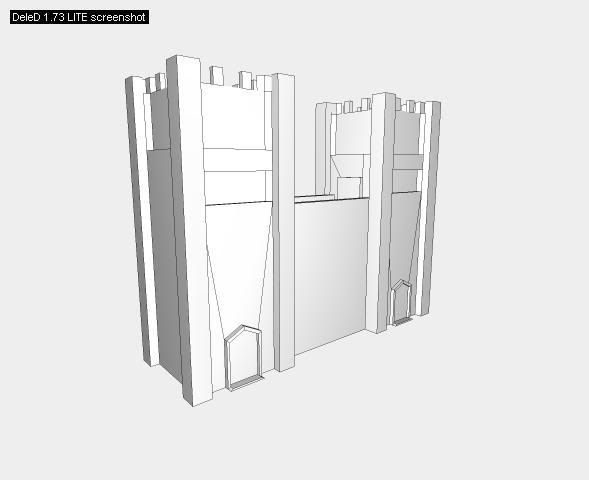
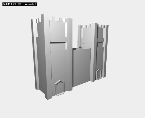
372 poly medieval basic tower
i have other prefabs to go on it, so i can mix and match usually to get a variety of models from half-dozen prefabs. |
|
| Back to top |
|
 |
Tincho
Member

Joined: 24 Aug 2007
Posts: 357
Location: ARGENTINA
|
 Posted: Sat Jan 26, 2008 12:11 pm Post subject: Posted: Sat Jan 26, 2008 12:11 pm Post subject: |
 |
|
| santutatu wrote: |
| I even think that it's gallery material for sure! |
Totally agree.  I like the upper lightmapping and the way it's textured I like the upper lightmapping and the way it's textured  |
|
| Back to top |
|
 |
WhiteWing
DeleD PRO user
Joined: 26 Sep 2007
Posts: 120
Location: Sweden
|
 Posted: Sat Jan 26, 2008 4:35 pm Post subject: Tower Prefabs Done Posted: Sat Jan 26, 2008 4:35 pm Post subject: Tower Prefabs Done |
 |
|
| Nocturn wrote: |
| I like the clean geometry of White Wing's guard tower - no wasted Polygons in there. But i think the upper part where the persons belong to, is too low, the roof could be a bit higher. |
Thanks Nocturn, yes the roof was a little low so I raised it a bit.
I like your clocktower, it look really great!
| Tincho07 wrote: |
EDIT: cool design, WhiteWing!  |
Thanks Tincho07, yes it came out kind of cool 
Everyone eles who add towers great work guys!
Ok here my tower textured and done 
Well its done for Tower Prefabs, but I will add control panel's and other things for my own project 

Polygons: 2064
Edges: 3932
Vertices: 2317 |
|
| Back to top |
|
 |
Nocturn
DeleD PRO user

Joined: 08 Aug 2004
Posts: 635
|
 Posted: Sun Jan 27, 2008 6:19 pm Post subject: Posted: Sun Jan 27, 2008 6:19 pm Post subject: |
 |
|
I've finished the tower:

Or view the High Resolution screen HERE
Or just simply download the *.dmf file here. (~ 700kb, 1 dmf, 1 dpf 4 textures)
Please notice: the upper arches have still a small glitch. I might update the download this week. The windows use "modulate" which is aviable in the LITE Version. (thanks to santutatu for the modulate notice)
Last edited by Nocturn on Mon Jan 28, 2008 5:13 pm; edited 3 times in total |
|
| Back to top |
|
 |
granada
Team member

Joined: 07 Aug 2004
Posts: 1955
Location: England
|
 Posted: Sun Jan 27, 2008 6:41 pm Post subject: Posted: Sun Jan 27, 2008 6:41 pm Post subject: |
 |
|
Very nice  . .
Dave
_________________
AMD Phenom(tm)IIx6 1090t Processor 3.20 GHS
8.00 GB memory
Windows 7 64 bit
Nvida Geforce GTX 580 |
|
| Back to top |
|
 |
Jeroen
Site Admin

Joined: 07 Aug 2004
Posts: 5332
Location: The Netherlands
|
 Posted: Sun Jan 27, 2008 6:46 pm Post subject: Posted: Sun Jan 27, 2008 6:46 pm Post subject: |
 |
|
| Very nice indeed! Although it seems a bit too dark. Perhaps its my settings? |
|
| Back to top |
|
 |
Nocturn
DeleD PRO user

Joined: 08 Aug 2004
Posts: 635
|
 Posted: Sun Jan 27, 2008 6:57 pm Post subject: Posted: Sun Jan 27, 2008 6:57 pm Post subject: |
 |
|
| Hm, don't know, ofcourse the Lightmapping is a bit dark (Clocktower at night) but everything is visible. |
|
| Back to top |
|
 |
granada
Team member

Joined: 07 Aug 2004
Posts: 1955
Location: England
|
 Posted: Sun Jan 27, 2008 7:47 pm Post subject: Posted: Sun Jan 27, 2008 7:47 pm Post subject: |
 |
|
| Quote: |
| Very nice indeed! Although it seems a bit too dark. Perhaps its my settings? |
Thats what i liked  . .
Dave
_________________
AMD Phenom(tm)IIx6 1090t Processor 3.20 GHS
8.00 GB memory
Windows 7 64 bit
Nvida Geforce GTX 580 |
|
| Back to top |
|
 |
Andreas233223
Member

Joined: 29 Jul 2007
Posts: 359
Location: Germany
|
 Posted: Mon Jan 28, 2008 2:26 pm Post subject: Posted: Mon Jan 28, 2008 2:26 pm Post subject: |
 |
|
All nice towers.
I also like Nocturn's very much. 
It could be usefull in a Game like Hellgate London or Alone in the Dark.
_________________
♥♦♣♠♥♦♣♠♥♦♣♠♥♦♣♠♥♦♣♠♥♦♣♠♥♦♣♠♥♦♣♠ |
|
| Back to top |
|
 |
santutatu
DeleD PRO user

Joined: 18 Aug 2007
Posts: 729
Location: ARGENTINA
|
 Posted: Mon Jan 28, 2008 4:11 pm Post subject: Posted: Mon Jan 28, 2008 4:11 pm Post subject: |
 |
|
Don't worry about modulate because it's avaible in LITE too 
_________________

 |
|
| Back to top |
|
 |
Nocturn
DeleD PRO user

Joined: 08 Aug 2004
Posts: 635
|
 Posted: Mon Jan 28, 2008 5:08 pm Post subject: Posted: Mon Jan 28, 2008 5:08 pm Post subject: |
 |
|
Thanks santutatu for the note. A quick update:
| Quote: |
- The Windows looks now better inside. The whole cube is not visible anymore. (culling!)
- Prefab file added
- Upper part is optimized.
- Scene Infos added
|
Download Link is still the same. Just click here to download it.
Last edited by Nocturn on Tue Feb 12, 2008 12:49 pm; edited 1 time in total |
|
| Back to top |
|
 |
|


