| View previous topic :: View next topic |
| Author |
Message |
trucker2000
DeleD PRO user

Joined: 11 May 2005
Posts: 1839
Location: Sacramento, California
|
 Posted: Sat Jul 12, 2008 2:26 am Post subject: Nerd Beach Posted: Sat Jul 12, 2008 2:26 am Post subject: Nerd Beach |
 |
|
Ok, so I lied. I said my last incarnation was up. It wasn't.
It's probably done now tho as I can't think of anything more to cram into that scene.

And the rest of the shots are:
Here
Here
Here
and
Here
_________________
Some day I will grow up and be a real modeler.
"Never give up! Never surrender!!"
Sys specs:
asus
8 gigs ram
Invidia gtx560 video card
Windows 8 (worst op sys Ever) |
|
| Back to top |
|
 |
Daaark
DeleD PRO user

Joined: 01 Sep 2004
Posts: 2696
Location: Ottawa, Canada
|
 Posted: Sat Jul 12, 2008 4:38 am Post subject: Re: Nerd Beach Posted: Sat Jul 12, 2008 4:38 am Post subject: Re: Nerd Beach |
 |
|
| trucker2000 wrote: |
Ok, so I lied. I said my last incarnation was up. It wasn't.
It's probably done now tho as I can't think of anything more to cram into that scene.

And the rest of the shots are:
Here
Here
Here
and
Here |
Instead of cramming more stuff into the scene, why not refine the scene? Your lighting on the sand is all over the place. You can see all the individual polygons. That's not good. The ground could really use some smoothing. Is there sand under the water? It seems to just end all of a sudden, and there is a like a dark hole.
You have a lot of thick surfaces, like the umbrella pole, the bar top, and other things. Why not thin them out? Maybe use more polygons on the roof of the stand, and make real 3D boards.
I like the scene. I like the object placement and the overall composition of the scene, especially the colors you ended up with. It just looks like you are happy to have very crude objects.
_________________
 |
|
| Back to top |
|
 |
Paul-Jan
Site Admin

Joined: 08 Aug 2004
Posts: 3066
Location: Lage Zwaluwe
|
 Posted: Sat Jul 12, 2008 4:57 am Post subject: Posted: Sat Jul 12, 2008 4:57 am Post subject: |
 |
|
Now that's a nerd beach, I guess modeling in (a) all of the Baywatch crew and (b) the revenge of the nerds guys would be one step too far, right? 
Kudos for doing some more work on the scene, it is definitely improving with every iteration. I kinda like the polygonated look of the sand (just like I enjoy heavily pixeled graphics), but I do think Daark is right. |
|
| Back to top |
|
 |
trucker2000
DeleD PRO user

Joined: 11 May 2005
Posts: 1839
Location: Sacramento, California
|
 Posted: Sat Jul 12, 2008 11:56 am Post subject: Posted: Sat Jul 12, 2008 11:56 am Post subject: |
 |
|
| Quote: |
| but I do think Daark is right. |
Me too.
Thanks for the suggestions. The reason the lighting is so bad is becouse I didn't light it. I tried it once, but then you couldn't see everything.
I like your idea for the roof. I have been looking for a long dead grass texture to use but haven't found one yet.
The water....It's actually a transperant plane.

I have no clue how I can make it any better.
Thanks for the suggestions. I'll take you up on them, and see if I can improve it.
| Quote: |
| It just looks like you are happy to have very crude objects. |
Naw. Just not enough time.
_________________
Some day I will grow up and be a real modeler.
"Never give up! Never surrender!!"
Sys specs:
asus
8 gigs ram
Invidia gtx560 video card
Windows 8 (worst op sys Ever) |
|
| Back to top |
|
 |
elementrix
DeleD PRO user

Joined: 11 May 2006
Posts: 1300
Location: The Netherlands
|
 Posted: Sat Jul 12, 2008 12:46 pm Post subject: Posted: Sat Jul 12, 2008 12:46 pm Post subject: |
 |
|
try to lightmap it with one directional light with the diffuse color a littlebit yellow (for the sun) and set the shadow opacity in the scene tab to something like 50. you should get a clear lightmap....
lightmapping can do wonders 
_________________
Chickens RULE | www.elementrix.nl |
|
| Back to top |
|
 |
trucker2000
DeleD PRO user

Joined: 11 May 2005
Posts: 1839
Location: Sacramento, California
|
 Posted: Sat Jul 12, 2008 8:45 pm Post subject: Posted: Sat Jul 12, 2008 8:45 pm Post subject: |
 |
|
Thanks. I'll give that a try after I fix a few things. 
_________________
Some day I will grow up and be a real modeler.
"Never give up! Never surrender!!"
Sys specs:
asus
8 gigs ram
Invidia gtx560 video card
Windows 8 (worst op sys Ever) |
|
| Back to top |
|
 |
trucker2000
DeleD PRO user

Joined: 11 May 2005
Posts: 1839
Location: Sacramento, California
|
 Posted: Sun Jul 13, 2008 12:00 am Post subject: Posted: Sun Jul 13, 2008 12:00 am Post subject: |
 |
|
Better??

Lightmapped and redone. I'm still working on the sand. Currently, it's just flat. I enlarged the beach and pond, and made it so it looks like you can see thru the water better. (you can, it just wasn't apperant before), remade the bar, , then, shrunk the pole for the umbrella and moved the lamp.
I still don't like the lamps position. I may move it again to another place and see if it looks better, or I may remove it and put in a firepit.
This is lightmapped too. (you just can't tell)
Edited to fix link.
_________________
Some day I will grow up and be a real modeler.
"Never give up! Never surrender!!"
Sys specs:
asus
8 gigs ram
Invidia gtx560 video card
Windows 8 (worst op sys Ever) |
|
| Back to top |
|
 |
Tincho
Member

Joined: 24 Aug 2007
Posts: 357
Location: ARGENTINA
|
 Posted: Sun Jul 13, 2008 1:22 am Post subject: Posted: Sun Jul 13, 2008 1:22 am Post subject: |
 |
|
I like your beach, Trucker. The new bar looks better.. more dynamic. The sand is the only thing you need to change (which, of course, is incidentally flat). After that, there's nothing you should change... maybe add?  |
|
| Back to top |
|
 |
santutatu
DeleD PRO user

Joined: 18 Aug 2007
Posts: 729
Location: ARGENTINA
|
 Posted: Sun Jul 13, 2008 3:15 am Post subject: Posted: Sun Jul 13, 2008 3:15 am Post subject: |
 |
|
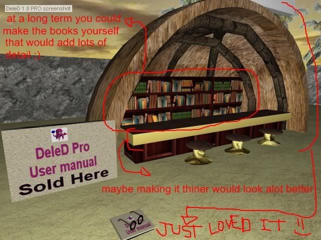
I really like the new bar too...It's like a big coconnut stucked in the sand...I really like the idea...maybe...you should make the bar slightly thiner :
just some notes

_________________

 |
|
| Back to top |
|
 |
santutatu
DeleD PRO user

Joined: 18 Aug 2007
Posts: 729
Location: ARGENTINA
|
 Posted: Sun Jul 13, 2008 3:16 am Post subject: Posted: Sun Jul 13, 2008 3:16 am Post subject: |
 |
|
I really like the new bar too...It's like a big coconnut stucked in the sand...I really like the idea...maybe...you should make the bar slightly thiner :
just some notes

_________________

 |
|
| Back to top |
|
 |
trucker2000
DeleD PRO user

Joined: 11 May 2005
Posts: 1839
Location: Sacramento, California
|
 Posted: Sun Jul 13, 2008 5:23 pm Post subject: Posted: Sun Jul 13, 2008 5:23 pm Post subject: |
 |
|
In an attempt at making this better, I have taking all the suggestions above. Here's what I have now:

Thankyou for all the suggestions. They do help. 
Here are the rest.
View from the side
Same view but closer in
Closeup of the book bar.
_________________
Some day I will grow up and be a real modeler.
"Never give up! Never surrender!!"
Sys specs:
asus
8 gigs ram
Invidia gtx560 video card
Windows 8 (worst op sys Ever) |
|
| Back to top |
|
 |
Jeroen
Site Admin

Joined: 07 Aug 2004
Posts: 5332
Location: The Netherlands
|
 Posted: Sun Jul 13, 2008 5:30 pm Post subject: Posted: Sun Jul 13, 2008 5:30 pm Post subject: |
 |
|
I want close-ups!  |
|
| Back to top |
|
 |
Daaark
DeleD PRO user

Joined: 01 Sep 2004
Posts: 2696
Location: Ottawa, Canada
|
 Posted: Sun Jul 13, 2008 5:55 pm Post subject: Posted: Sun Jul 13, 2008 5:55 pm Post subject: |
 |
|
The ground needs smoothing. It sticks out like a sore thumb. Also, is this the beach? It looks like there is a puddle in the middle of a sandy place. Would be better if you actually had a coast line with water going out, and maybe some stuff in the water, like rocks coming up.
_________________
 |
|
| Back to top |
|
 |
trucker2000
DeleD PRO user

Joined: 11 May 2005
Posts: 1839
Location: Sacramento, California
|
 Posted: Sun Jul 13, 2008 7:19 pm Post subject: Posted: Sun Jul 13, 2008 7:19 pm Post subject: |
 |
|
| Daaark wrote: |
| The ground needs smoothing. It sticks out like a sore thumb. Also, is this the beach? It looks like there is a puddle in the middle of a sandy place. Would be better if you actually had a coast line with water going out, and maybe some stuff in the water, like rocks coming up. |
I thought about that. I'm no good at making textures, so the water problem will have to stay there. My thoughts, and I may still do it, is to place a wall of rocks, like a breakwater on 2 sides so that it actually Is a pool. I'm still thinking about that.
Jeroen, you asked for it, you got it.
Have a seat at the bar.
The lounge chairs
The book and glasses.
The lamp.
now if only deled would remember the last folder I put those screenshots in...........
_________________
Some day I will grow up and be a real modeler.
"Never give up! Never surrender!!"
Sys specs:
asus
8 gigs ram
Invidia gtx560 video card
Windows 8 (worst op sys Ever) |
|
| Back to top |
|
 |
trucker2000
DeleD PRO user

Joined: 11 May 2005
Posts: 1839
Location: Sacramento, California
|
 Posted: Sun Jul 13, 2008 7:52 pm Post subject: Posted: Sun Jul 13, 2008 7:52 pm Post subject: |
 |
|
Does this make more since??
_________________
Some day I will grow up and be a real modeler.
"Never give up! Never surrender!!"
Sys specs:
asus
8 gigs ram
Invidia gtx560 video card
Windows 8 (worst op sys Ever) |
|
| Back to top |
|
 |
|


