| View previous topic :: View next topic |
| Author |
Message |
WhiteWing
DeleD PRO user
Joined: 26 Sep 2007
Posts: 120
Location: Sweden
|
 Posted: Sun Aug 17, 2008 8:32 pm Post subject: WhiteWing Summer Compo Entrance Posted: Sun Aug 17, 2008 8:32 pm Post subject: WhiteWing Summer Compo Entrance |
 |
|
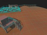
Soon my entrance is ready so I decided to give you guys a little peek of what Im doing.

The welcome sign wont be where it is at right now, just there so you can see part of the saloon as well.  |
|
| Back to top |
|
 |
trucker2000
DeleD PRO user

Joined: 11 May 2005
Posts: 1839
Location: Sacramento, California
|
 Posted: Mon Aug 18, 2008 2:19 am Post subject: Posted: Mon Aug 18, 2008 2:19 am Post subject: |
 |
|
Cool. Will love seeing more pics.
_________________
Some day I will grow up and be a real modeler.
"Never give up! Never surrender!!"
Sys specs:
asus
8 gigs ram
Invidia gtx560 video card
Windows 8 (worst op sys Ever) |
|
| Back to top |
|
 |
elementrix
DeleD PRO user

Joined: 11 May 2006
Posts: 1300
Location: The Netherlands
|
 Posted: Mon Aug 18, 2008 12:21 pm Post subject: Posted: Mon Aug 18, 2008 12:21 pm Post subject: |
 |
|
some lighting would definitely help:)
_________________
Chickens RULE | www.elementrix.nl |
|
| Back to top |
|
 |
WhiteWing
DeleD PRO user
Joined: 26 Sep 2007
Posts: 120
Location: Sweden
|
 Posted: Tue Aug 19, 2008 7:07 am Post subject: Posted: Tue Aug 19, 2008 7:07 am Post subject: |
 |
|
| elementrix wrote: |
| some lighting would definitely help:) |
There will be some lights when the secen is ready, patience my friend patience  |
|
| Back to top |
|
 |
WhiteWing
DeleD PRO user
Joined: 26 Sep 2007
Posts: 120
Location: Sweden
|
 Posted: Tue Aug 19, 2008 4:28 pm Post subject: Posted: Tue Aug 19, 2008 4:28 pm Post subject: |
 |
|
Ok here is some more screenshots, and the scene is lighted even if its not 100% ready yet. Hope you like it!

 |
|
| Back to top |
|
 |
WhiteWing
DeleD PRO user
Joined: 26 Sep 2007
Posts: 120
Location: Sweden
|
 Posted: Fri Aug 22, 2008 5:23 pm Post subject: Final update Posted: Fri Aug 22, 2008 5:23 pm Post subject: Final update |
 |
|
Here is the finished scene 

   |
|
| Back to top |
|
 |
Daaark
DeleD PRO user

Joined: 01 Sep 2004
Posts: 2696
Location: Ottawa, Canada
|
 Posted: Fri Aug 22, 2008 5:33 pm Post subject: Posted: Fri Aug 22, 2008 5:33 pm Post subject: |
 |
|
I like it, but in some spots your shadow resolution is HORRIBLE. It's all just black blobs smeared all over the place. It's even hard to make out the shape of the saloon from the outside because of this.
Cut down any large polygons to smaller sizes. This will help your shadows significantly. It's probably your ground planes being way too big (just a guess).
In order to get the best results from DeleD's lightmapper, none of your polygons should be bigger than the biggest size you'd want to stretch whatever the size of your max individual texture size is.
Just some constructive criticism. Breaking up those large polygons will give you a lot more 'free' detail in that image. Your sign shadow should be an almost perfect tracing of the sign, not 3 black dots.
Example: Look at my mesh. None of my polygons are bigger than 120x120, giving me complete control over my shadowing.
http://img.photobucket.com/albums/v227/Vampyre_Dark/DeleD/compobeach3.jpg
_________________
 |
|
| Back to top |
|
 |
Daaark
DeleD PRO user

Joined: 01 Sep 2004
Posts: 2696
Location: Ottawa, Canada
|
 Posted: Fri Aug 22, 2008 5:44 pm Post subject: Posted: Fri Aug 22, 2008 5:44 pm Post subject: |
 |
|
Better example: 
_________________
 |
|
| Back to top |
|
 |
elementrix
DeleD PRO user

Joined: 11 May 2006
Posts: 1300
Location: The Netherlands
|
 Posted: Fri Aug 22, 2008 9:56 pm Post subject: Posted: Fri Aug 22, 2008 9:56 pm Post subject: |
 |
|
well daaark I looked at some of his shadows around his sign and found some seams and drew some black lines over them, going out from those black lines I drew some gray lines and it looks like he uses a grid and is just using a very small lightmapping size?:

_________________
Chickens RULE | www.elementrix.nl |
|
| Back to top |
|
 |
Daaark
DeleD PRO user

Joined: 01 Sep 2004
Posts: 2696
Location: Ottawa, Canada
|
 Posted: Fri Aug 22, 2008 10:03 pm Post subject: Posted: Fri Aug 22, 2008 10:03 pm Post subject: |
 |
|
That's a possibility, but he also has what looks like very long polygons in the saloon itself, which will throw off the resolution too.
_________________
 |
|
| Back to top |
|
 |
WhiteWing
DeleD PRO user
Joined: 26 Sep 2007
Posts: 120
Location: Sweden
|
 Posted: Wed Aug 27, 2008 1:08 pm Post subject: Posted: Wed Aug 27, 2008 1:08 pm Post subject: |
 |
|

 
Last edited by WhiteWing on Thu Sep 04, 2008 4:19 pm; edited 2 times in total |
|
| Back to top |
|
 |
trucker2000
DeleD PRO user

Joined: 11 May 2005
Posts: 1839
Location: Sacramento, California
|
 Posted: Thu Aug 28, 2008 12:13 am Post subject: Posted: Thu Aug 28, 2008 12:13 am Post subject: |
 |
|
Wow, that looks great.
_________________
Some day I will grow up and be a real modeler.
"Never give up! Never surrender!!"
Sys specs:
asus
8 gigs ram
Invidia gtx560 video card
Windows 8 (worst op sys Ever) |
|
| Back to top |
|
 |
WhiteWing
DeleD PRO user
Joined: 26 Sep 2007
Posts: 120
Location: Sweden
|
 Posted: Fri Sep 05, 2008 8:31 am Post subject: Posted: Fri Sep 05, 2008 8:31 am Post subject: |
 |
|
I made two last updates on my scene.
1. I moved the light source so that I get light on the front of the saloon.
2. I remodel the windmill since the old one look a bit boring.
 
Scene info:
Environment: Route 66
Props: Saloon , Slot machine & Parasol
Objects: 1192
Polygons: 24184
Edges: 48951
Vertices:27251 |
|
| Back to top |
|
 |
afecelis
DeleD PRO user

Joined: 08 Aug 2004
Posts: 427
Location: Colombia
|
 Posted: Fri Sep 05, 2008 1:26 pm Post subject: Posted: Fri Sep 05, 2008 1:26 pm Post subject: |
 |
|
Nice!  Very well integrated with the skybox and the lighting and coloring of the scene reflects that as well. Very well integrated with the skybox and the lighting and coloring of the scene reflects that as well.
White Wing, where in Deled do you get all the scene info you're posting?
regards and congrats,
Alvaro |
|
| Back to top |
|
 |
WhiteWing
DeleD PRO user
Joined: 26 Sep 2007
Posts: 120
Location: Sweden
|
 Posted: Fri Sep 05, 2008 2:18 pm Post subject: Posted: Fri Sep 05, 2008 2:18 pm Post subject: |
 |
|
| afecelis wrote: |
Nice!  Very well integrated with the skybox and the lighting and coloring of the scene reflects that as well. Very well integrated with the skybox and the lighting and coloring of the scene reflects that as well.
White Wing, where in Deled do you get all the scene info you're posting?
|
Thank you very much 
The info I get from:
 |
|
| Back to top |
|
 |
|


