| View previous topic :: View next topic |
| Author |
Message |
Alovon
Member

Joined: 21 Jul 2011
Posts: 21
Location: The Middle of Nowhere... USA
|
 Posted: Fri Aug 09, 2013 3:38 pm Post subject: A Little House Posted: Fri Aug 09, 2013 3:38 pm Post subject: A Little House |
 |
|
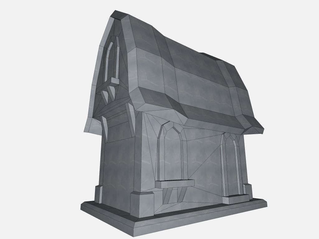
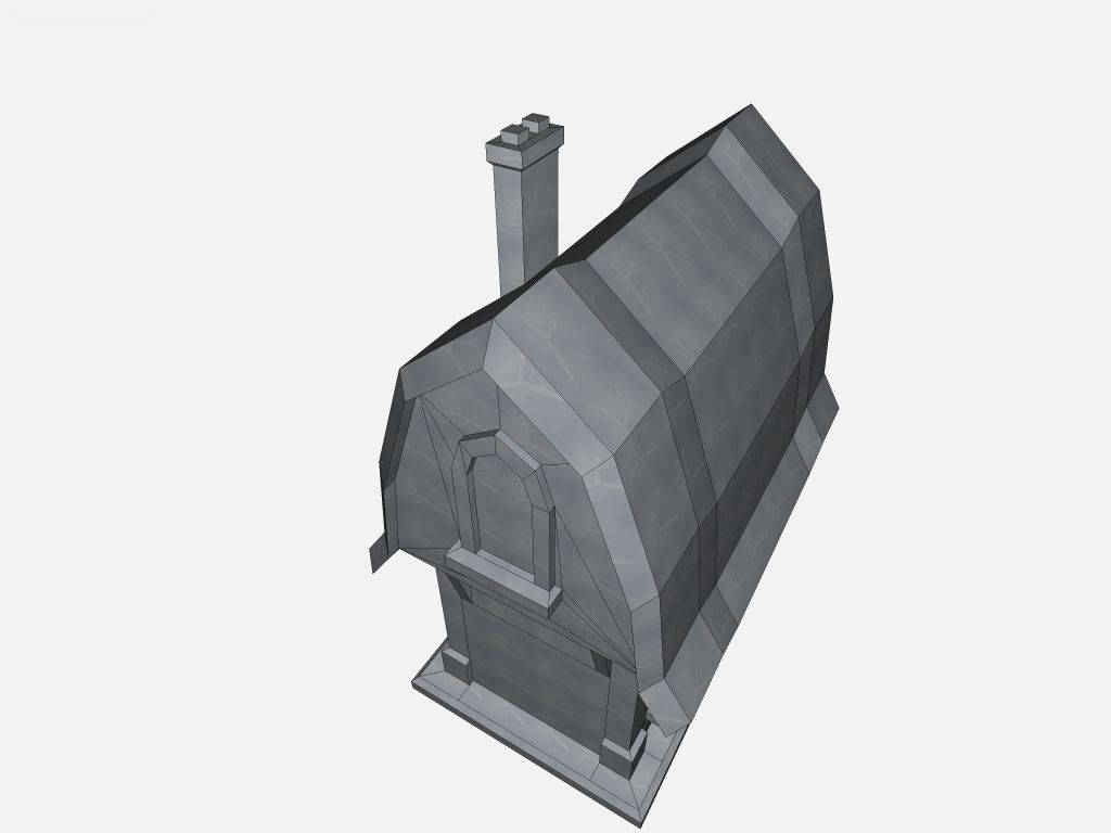
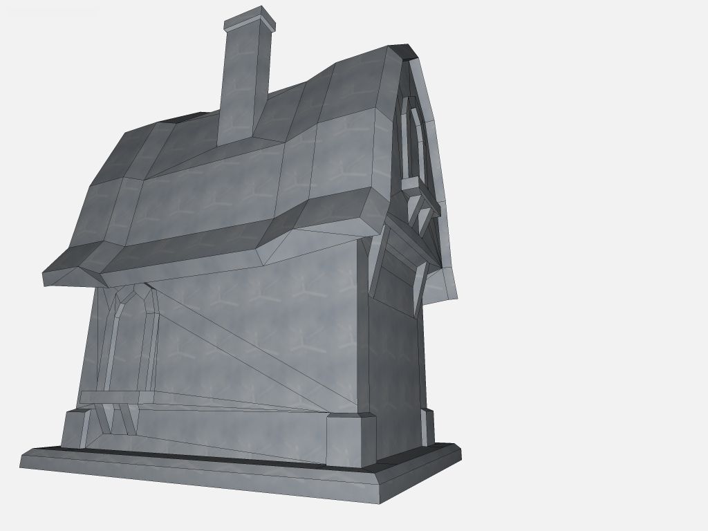
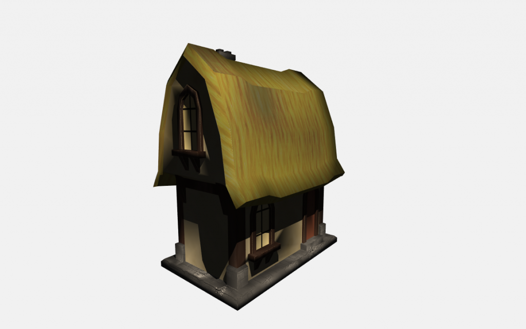
No texturing or anything. I'm still complete crap at that, but I thought it would be fun to give DeleD a go again. It's been a little bit, so hello! 


_________________
Artwork = Food. Create to survive!
And brraaaiiinnnsss.... That too... |
|
| Back to top |
|
 |
Jeroen
Site Admin

Joined: 07 Aug 2004
Posts: 5332
Location: The Netherlands
|
 Posted: Fri Aug 09, 2013 4:14 pm Post subject: Posted: Fri Aug 09, 2013 4:14 pm Post subject: |
 |
|
Hey that's a goodlooking little house there! It has a fantasy look-and-feel, which I like very much. I'd love to see this textured and lightmapped. 
_________________
Check out Figuro, our online 3D app! More powerful 3D tools for free. |
|
| Back to top |
|
 |
granada
Team member

Joined: 07 Aug 2004
Posts: 1955
Location: England
|
 Posted: Fri Aug 09, 2013 5:28 pm Post subject: Posted: Fri Aug 09, 2013 5:28 pm Post subject: |
 |
|
Thats a cool shape,would look good textured  . .
Dave
_________________
AMD Phenom(tm)IIx6 1090t Processor 3.20 GHS
8.00 GB memory
Windows 7 64 bit
Nvida Geforce GTX 580 |
|
| Back to top |
|
 |
Alovon
Member

Joined: 21 Jul 2011
Posts: 21
Location: The Middle of Nowhere... USA
|
 Posted: Sat Aug 10, 2013 6:19 am Post subject: Posted: Sat Aug 10, 2013 6:19 am Post subject: |
 |
|
Alright, so this is only my second attempt at texture mapping, and it came out so-so. Any tips?

_________________
Artwork = Food. Create to survive!
And brraaaiiinnnsss.... That too... |
|
| Back to top |
|
 |
Jeroen
Site Admin

Joined: 07 Aug 2004
Posts: 5332
Location: The Netherlands
|
|
| Back to top |
|
 |
AWM Mars
Member

Joined: 06 Jan 2010
Posts: 1195
Location: Wilts England
|
 Posted: Sun Aug 18, 2013 7:15 am Post subject: Posted: Sun Aug 18, 2013 7:15 am Post subject: |
 |
|
The reason why you have some issues with the texturing and lightmapping is the polygon shapes/sizes. It looks like you have optimised the model, which while reducing polygon size, they also make polygon variety in size and shape, a pain for the lightmapping engine to cope with.
Do you have a version, pre-optimised?
_________________
Politeness is priceless when received, cost nothing to own or give, yet some cannot afford.
Checkout:
http://www.awm.mars.yourinside.com/
http://www.bccservices.co.uk
http://www.localtradecheck.co.uk |
|
| Back to top |
|
 |
CC
Member

Joined: 26 Nov 2010
Posts: 24
Location: Maine, U.S.A.
|
 Posted: Sun Aug 18, 2013 5:23 pm Post subject: Posted: Sun Aug 18, 2013 5:23 pm Post subject: |
 |
|
| I generally select the polygons that I want the same texture, select face mode, Gen UV, and hit OK. Then I scale and rotate to fit while still in face mode. |
|
| Back to top |
|
 |
Alovon
Member

Joined: 21 Jul 2011
Posts: 21
Location: The Middle of Nowhere... USA
|
 Posted: Tue Aug 20, 2013 9:28 am Post subject: Posted: Tue Aug 20, 2013 9:28 am Post subject: |
 |
|
Is there any way to blur a texture less when using a tiny texture? To keep it more pixelated? I've seen some really cool toony styles and I really like the retro pixel look, and I'd like to keep that in my work. Is that just how deled renders textures, or what?
_________________
Artwork = Food. Create to survive!
And brraaaiiinnnsss.... That too... |
|
| Back to top |
|
 |
AWM Mars
Member

Joined: 06 Jan 2010
Posts: 1195
Location: Wilts England
|
|
| Back to top |
|
 |
AWM Mars
Member

Joined: 06 Jan 2010
Posts: 1195
Location: Wilts England
|
 Posted: Tue Aug 20, 2013 7:03 pm Post subject: Posted: Tue Aug 20, 2013 7:03 pm Post subject: |
 |
|
| CC wrote: |
| I generally select the polygons that I want the same texture, select face mode, Gen UV, and hit OK. Then I scale and rotate to fit while still in face mode. |
Yeah, that's standard, but the issue with the optimising function, is that it leaves polygons at different shapes and sizes, which the shadow mapping finds hard to cope with, given the resolutions, making them either coarse in some areas, and really fine in others. This is evident around the windows in the rendered model.
_________________
Politeness is priceless when received, cost nothing to own or give, yet some cannot afford.
Checkout:
http://www.awm.mars.yourinside.com/
http://www.bccservices.co.uk
http://www.localtradecheck.co.uk |
|
| Back to top |
|
 |
Alovon
Member

Joined: 21 Jul 2011
Posts: 21
Location: The Middle of Nowhere... USA
|
 Posted: Wed Aug 21, 2013 12:49 pm Post subject: Posted: Wed Aug 21, 2013 12:49 pm Post subject: |
 |
|
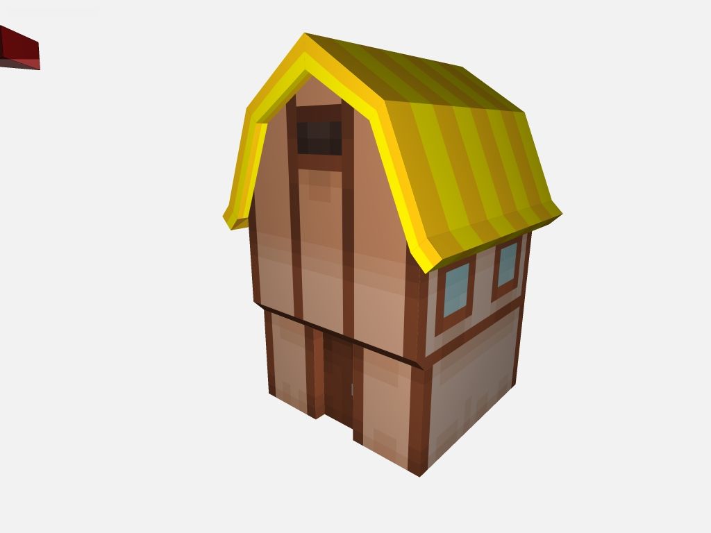
Here we go. Getting a bit better at this. Not too detailed, but I really wanted that toony pixely goodness. This was a 32x32 texture scaled up to 2048x2048 (a bit excessive, but it makes it clearer in the UV editor) I really like the look.

8 DeleD world units = 1 pixel (roughly) which made the mapping SO much easier in my opinion. Is there any UV editor with an align to grid option? That would be a glorious innovation! Anyway, back to experimenting! Peace!
_________________
Artwork = Food. Create to survive!
And brraaaiiinnnsss.... That too... |
|
| Back to top |
|
 |
|


